
Creative Labs
Brand Identity
Scroll ↓
Creative Labs is an innovation hub that fosters creativity, offering mentoring support to refine and validate business ideas. They use methodology and tools for workshops focused on business model development, innovation assessment, and market analysis.
The task involved creating a core concept for brand identity, leading to logo design and fundamental identity elements.
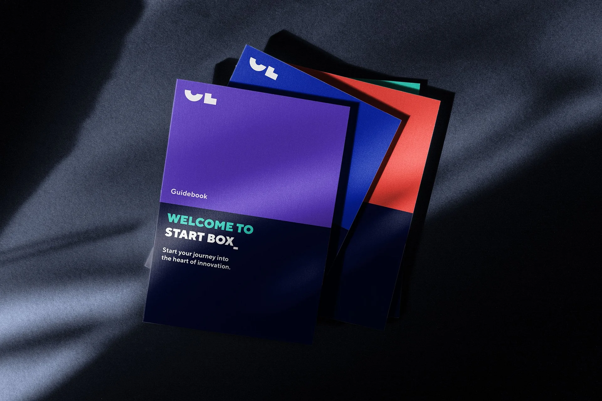
The apparently abstract logo comprises the initial letters of Creative Labs that have been sliced in half to form blocks, symbolizing the act of building.
The severed portion of the letters represents a symbolic free space for ideas. The blocks influenced the creation of a modular design system that is both easy to customize and implement.
4 elements
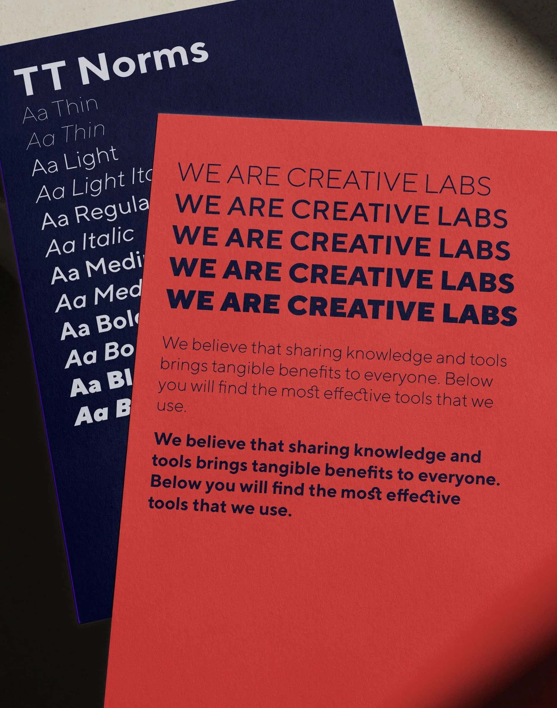
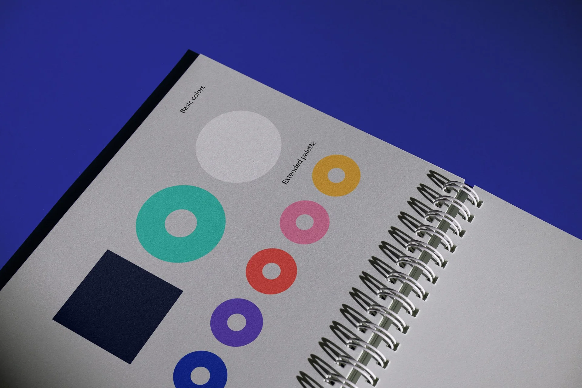
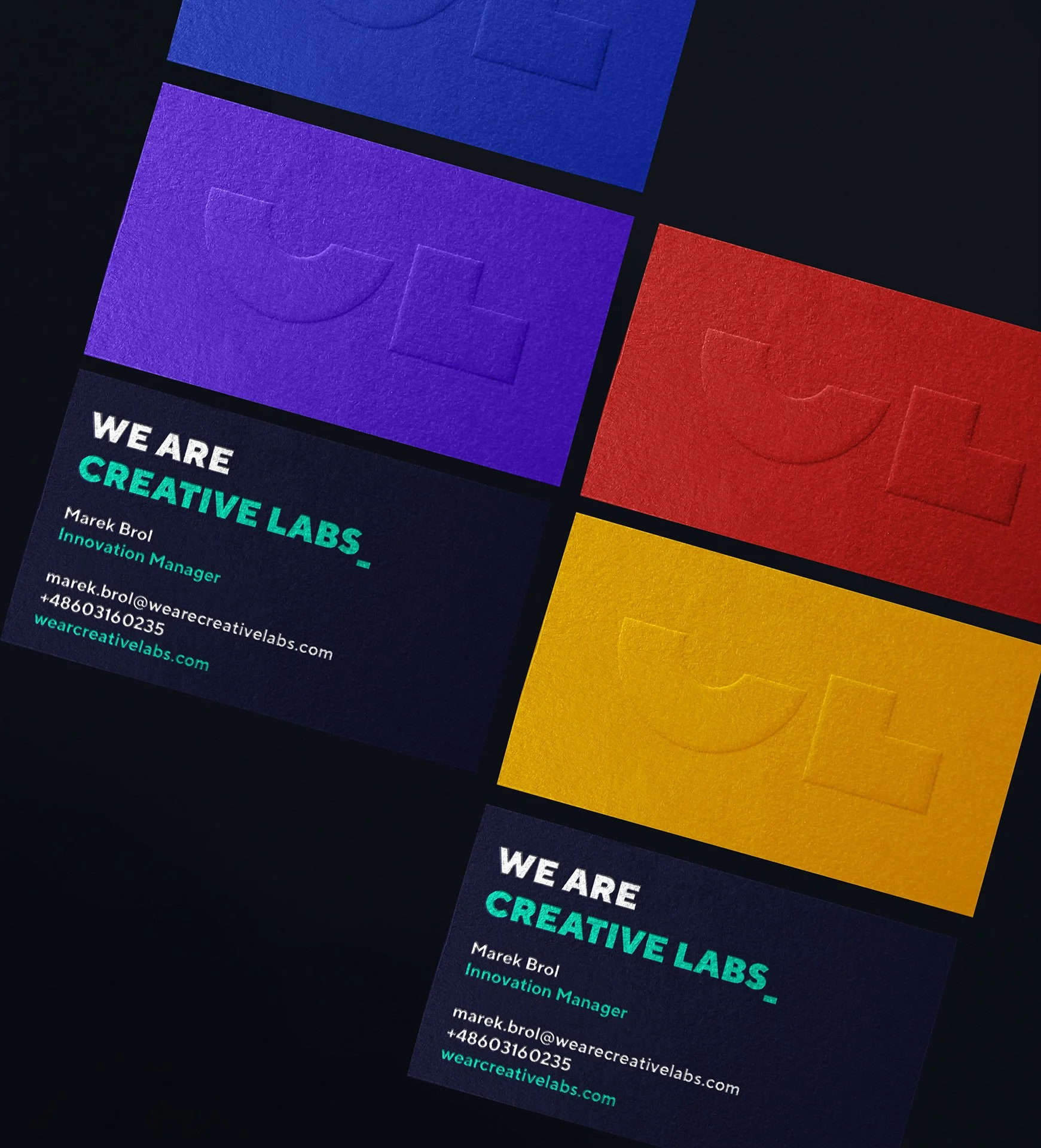
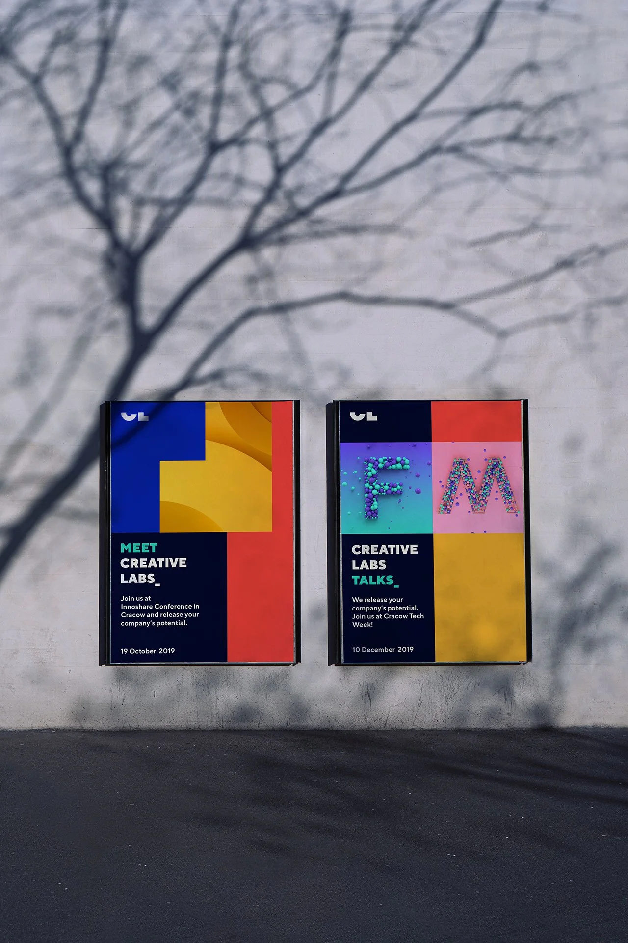
The challenge was to create a corporate image that embodies the character, identity, and innovative approach of Creative Labs. The brand's essence is captured through four key design elements: the logo, font, colors, and geometric shapes.
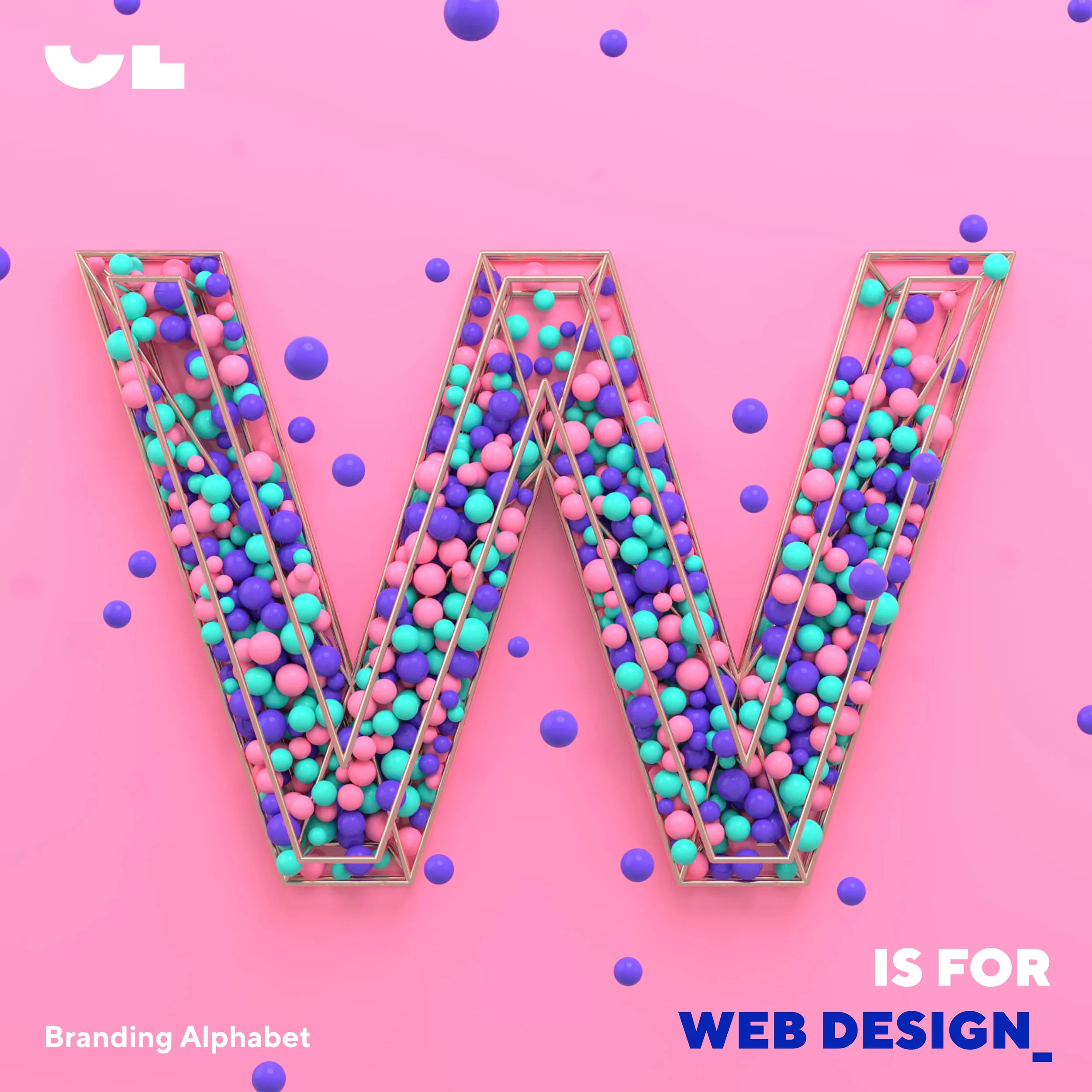
The system was complemented by defining illustrative styles - both 2D and 3D, as well as duotone portrait photography.


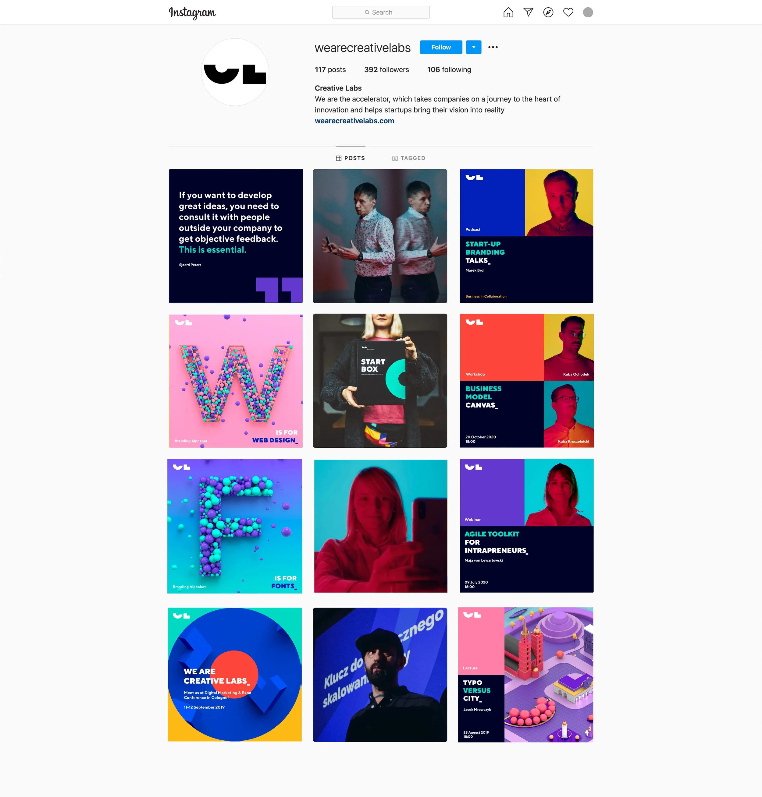
System colors - posters example


Make it stand out
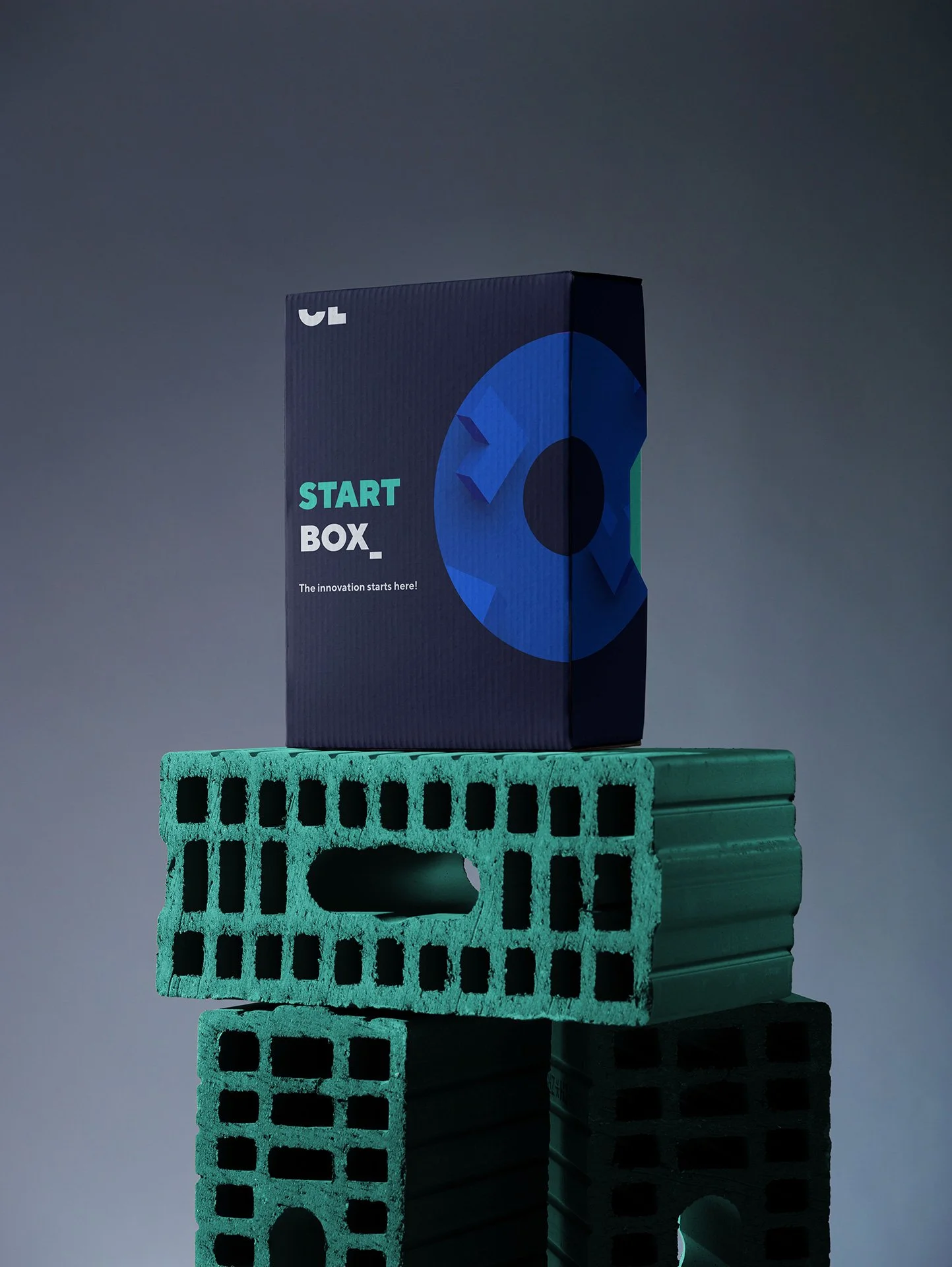
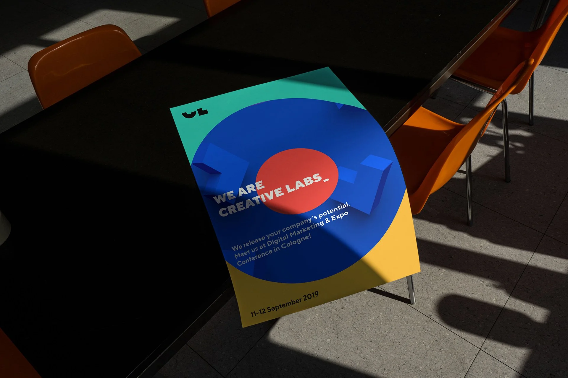
Choosing the isometric style was a natural decision. This perspective emphasizes CL's key values, such as development and growth, and it is perfectly reflected in the block style and the grid board, enabling us to build freely. As the next step, we added motion to bring the entire system to life.
Agility is key
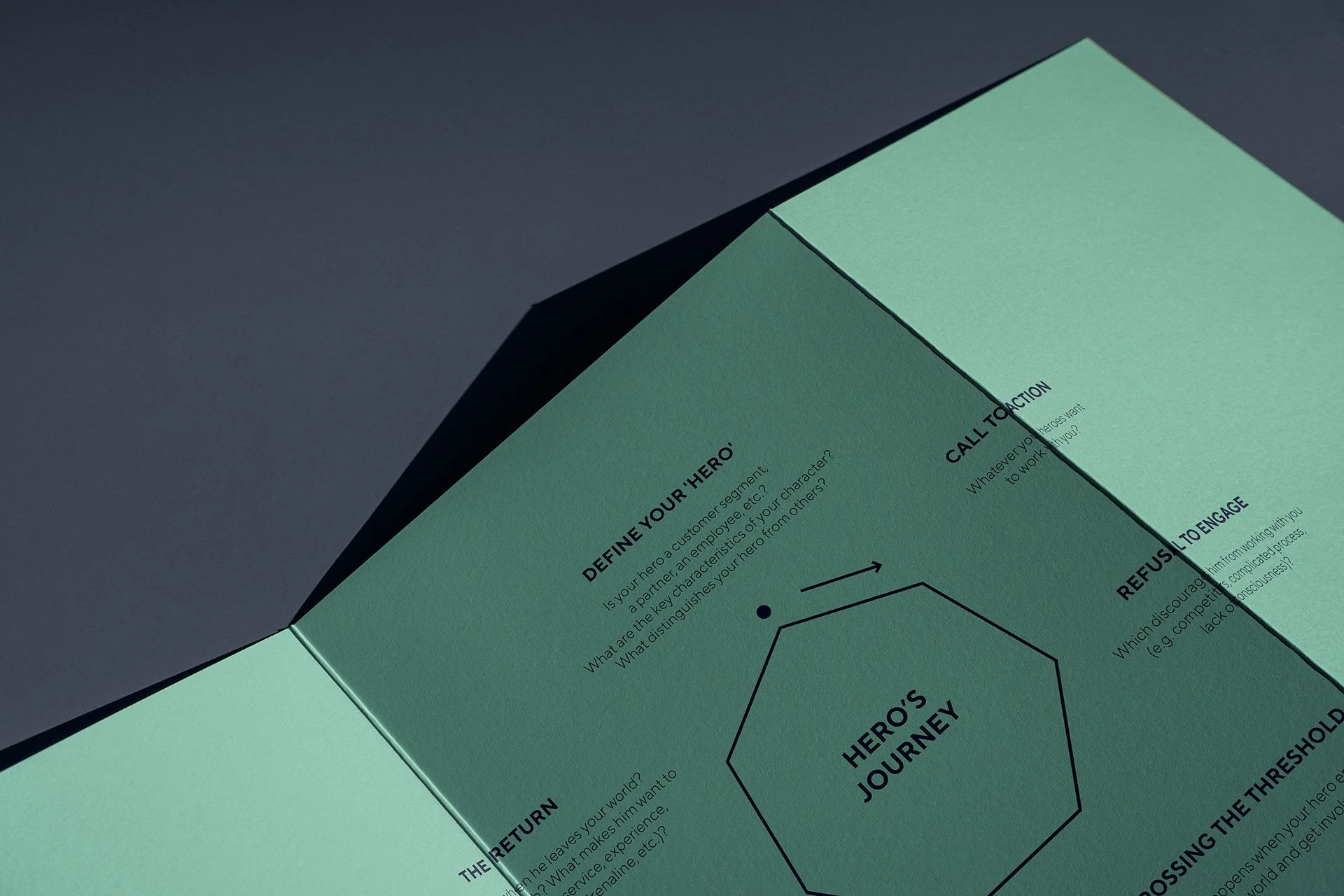
The Creative Labs' design system is designed to be flexible and responsive to various needs and touchpoints, all while retaining a cohesive structure and a distinctive look and feel.


Responsibilities:
Concept development
System design
Art and Creative direction
Team:
3D Modeling: Artur Knapik, Piotr Laskowski, Magdalena Paleczna
Animation: Artur Knapik, Weronika Kuc, Magdalena Paleczna
Portrait photos: Marcin Malicki
Event photos: Krzysztof Klimek